
If your audience is zoning out, checking their phones, or hopping off your Zoom, the issue isn’t your slide design…
It’s your story flow.
I’ve seen too many presenters obsess over fonts, colors, and slick animations, only to lose their attendees’ attention five minutes into the virtual presentation. Your visuals matter, sure—but if the structure of your message is broken, the slide deck won’t save you.
Here’s how to stop blaming your presentation slides and start building a logical flow that keeps your audience engaged from the very first frame.

Pop in your email below, and we’ll zip it straight to your inbox so you never lose it!
Clarity Beats Cleverness—Every Time
The goal of your slides isn’t to impress. It’s to help your audience follow your ideas, retain your key takeaways, and take action.
That means you need:
A clear beginning, middle, and end
A narrative that flows logically
Visual aids that break down complex ideas and support—not distract from—your message
And language that’s concise, intentional, and easy for your target audience to follow
A good story will carry mediocre slides. But great slides can’t carry a confusing story.
Structure Matters More Than Style
Your entire presentation should function like a well-edited sales letter:
Start with a hook at the beginning of your presentation (a question, a bold statement, or a quick win)
Use real-world examples to tell your story and keep the audience’s attention
Layer in interactive elements like live chat, quick polls, or audience questions during virtual meetings or webinars
Build toward a single key message, not 47 scattered points
End with a strong call to action that aligns with the flow of the event
Want to know the fastest way to confuse an attendee? Jump around between slides, ramble through ideas and concepts, and make them work to figure out where you’re going.
Best Practices for Slide Design (That Actually Work)

If you’re going to use Google Slides, PowerPoint, or any presentation software, keep it simple. Here’s what works:
Keep things simple—use minimal text per slide
One idea per slide—make it easier for your audience to follow along
Use visuals strategically—add visuals that support the point, not just fill space
Be mindful of your choice of words—clarity wins
Don’t overuse animation—it rarely enhances your delivery
A good presentation doesn’t need flashy transitions. It needs clarity and confidence.
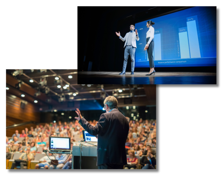
Hosting Virtual Events? Your Slides Matter More
In virtual events, virtual meetings, or live events, your presentation slides become the stand-in for your stage presence.
Without body language and physical proximity, you need to be extra strategic:
Use your event platform or event app to guide people through the presentation to ensure participation
Use live chat and Q&A strategically to engage your audience
Rehearse ahead of time to test how your slides land across different screens
Always enhance your delivery by syncing your energy with your story
And remember—when you’re hosting virtual events, your presentation skills are amplified (for better or worse).
Fix the Flow First
Before you build your next slide deck, do this:
Map your story from start to finish.
Identify the key points that support your key message.
Use types of content that speak to attendees’ pain points and desires.
Build slides that support that flow—not distract from it.
The result? An engaging and memorable experience that makes it easier for your attendees to retain the message, take the action, and become buyers.
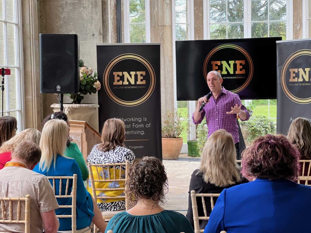
Whether you’re speaking at a live event, a virtual event, or planning an in-person conference or event as an event planner, the same rule applies:
The order of your story matters more than the design of your slides.